CSS布局(一)
|
|
要说清楚布局,我们这里借用书上的例子来说。
首先,这是一个咖啡店的主页,这是没有布局之前的正常流网页。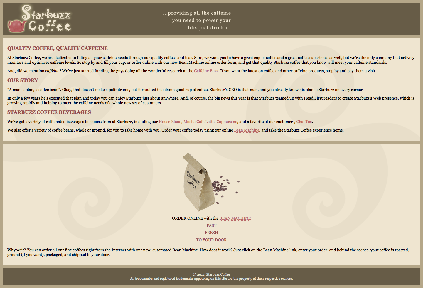
先附上源码:
|
|
css文件:
|
|
可以看出,这是一个典型的具有header,footer,content以及sidebar的布局。那么我们用css怎么来实现呢。
在这之前,先说说如何浮动元素
- 给要浮动的元素指定一个id
- 指定宽度(对于浮动元素必须有宽度)
- 让它浮动(float:left/right;)
方法一:让sidebar浮动,main部分可以随浏览器自由伸缩。
- 要让sidebar浮动在main的右边,我们要先考虑下这几部分之间的顺序。
- 浮动是什么意思呢,浮动是把元素从正常文档流中拿出,让他尽可能向一个方向偏离。他前面和后面的块元素会当他不存在一样,继续按顺序在正常流中摆放,而块元素中的内联元素会留意浮动元素的边界。
- 所以让我们来想想,假如按照现在HTML文档中的顺序,浏览器先摆放header,因为是div元素,占满一行,再换行摆放main,main也一样是div元素,占满一行,那么到sidebar的时候浏览器发现他是个向右浮动元素,那么浏览器会在main下面把sidebar浮动在右边,而footer继续正常摆放,那看上去就像这样:
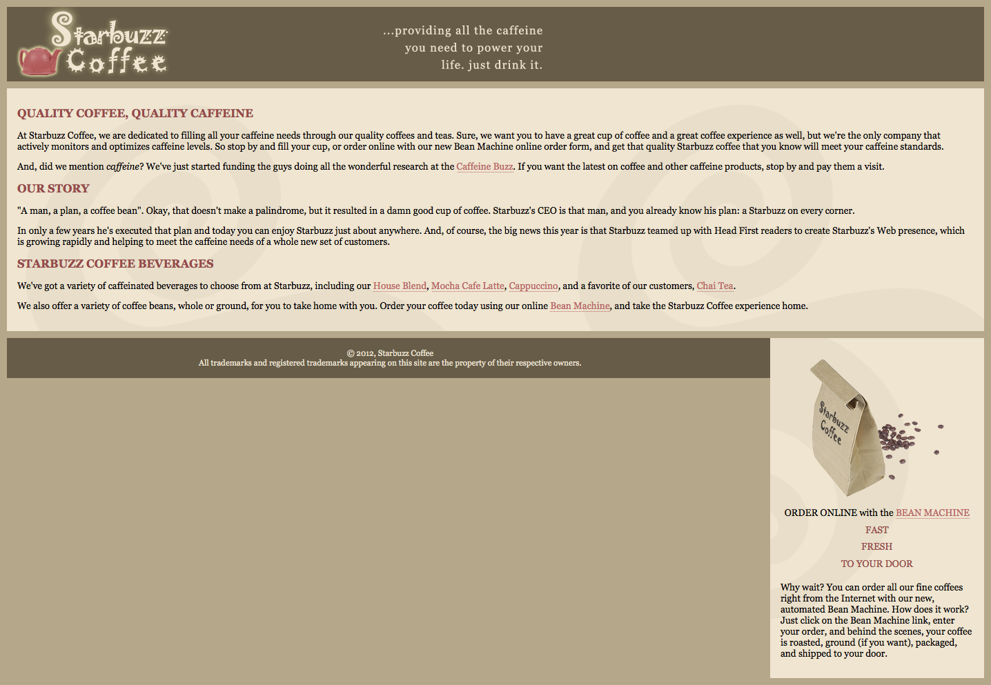
这显然不是我们想要的效果,所以聪明的你肯定也想到了,我们想让sidebar在header下面浮动,就要把它紧跟header放置。改动我们的代码,调整位置,并在#sidebar中添加:
|
|
现在我们看到的网页就像这样: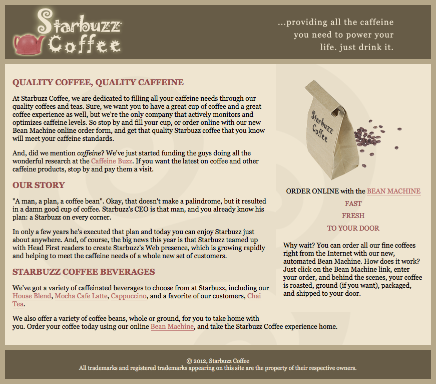
调整浏览器窗口大小,让它最大化,情况就变成了这样: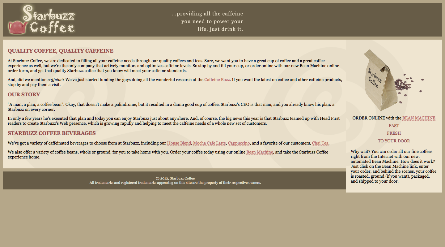
上面的网页现在有两个问题:
- main部分还是平铺的,main里面的内容(内联元素)是围绕在sidebar周围的,实际上这时候main整个部分是在sidebar下面的,我们怎么让它们看上去是显示在一排的呢,很简单,给main加上右侧外边距,让它的大小至少等于sidebar的宽度。
- 页脚在全屏的时候上移,这也不是我们想要的效果,这里我们要用到一个新属性,clear(清除浮动)。clear的意思就是:当元素流入页面时,在这个元素的左边或者右边或者两侧不允许有浮动内容。如果有,则会把元素下移,直到没有浮动的地方。
所以,上面两个问题我们再加两个样式就搞定:
|
|
最后完成的网页如图所示: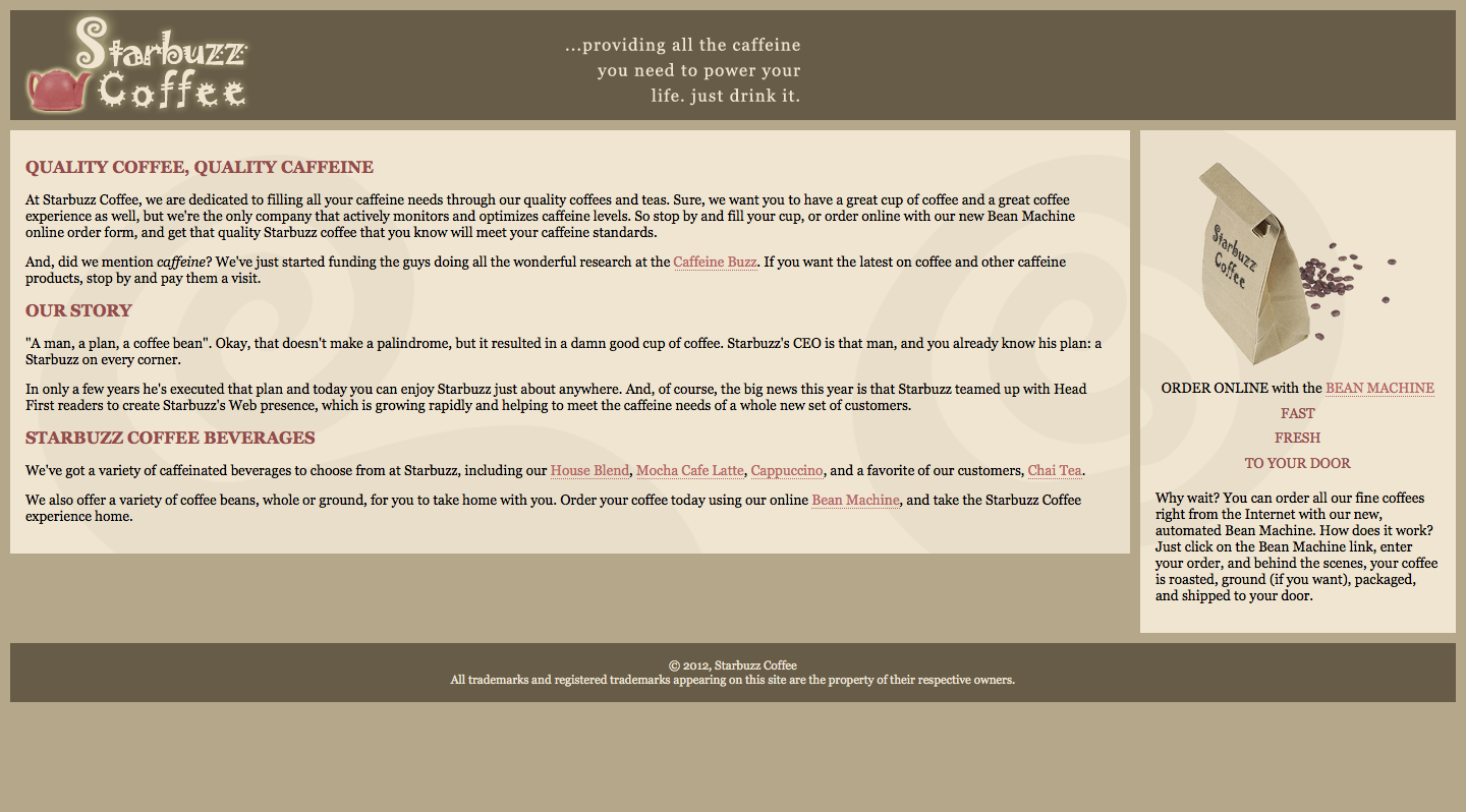
虽然看上去还不错,但这种方法有两个缺点:
- 随着浏览器大小的变化,main部分和sidebar不一样高,所以会有留白
- 如果在小屏或者手机或者其他浏览器宽度小于一定值时浏览,sidebar部分会在main的上面,这可能对用户来说并不是一件好事,我们应该首先显示重要信息。
方法2:右紧左松记忆法,即让main部分浮动,sidebar随浏览器调整大小(可以解决上面第二个问题)
- 调整HTML为最初的顺序
- 添加如下代码:
|
|
效果如下: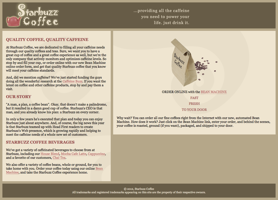
可以看出,上面方法还是有两个问题:
- main部分和sidebar不一样高
- sidebar在浏览器足够宽的时候会显得过于扩展。
方法3:在上面这个例子中,布局自动扩展给我带了了一些小问题,这个时候我们可能希望锁定布局,当用户调整屏幕大小时,让设计保持原样,这称为冻结布局。
- 首先,给HTML中的四部分最外层加上一个新的div,即用一个div把header,main,sidebar,footer包裹起来,id为allcontent
- 给allcontent添加样式
|
|
注意:此处添加的两项是在之前方法二的基础上添加
现在网页是下面这样: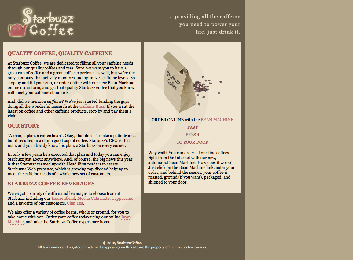
可以看出:main和sidebar两部分的相对大小不再随浏览器变化,但是右边有大量留白。
方法4:解决上述留白问题,我们使用凝胶布局。这种布局会锁定页面中内容区的宽度,但会将内容在浏览器居中。
- 我们只需要在方法三的基础上添加如下样式:
|
|
现在网页是这样: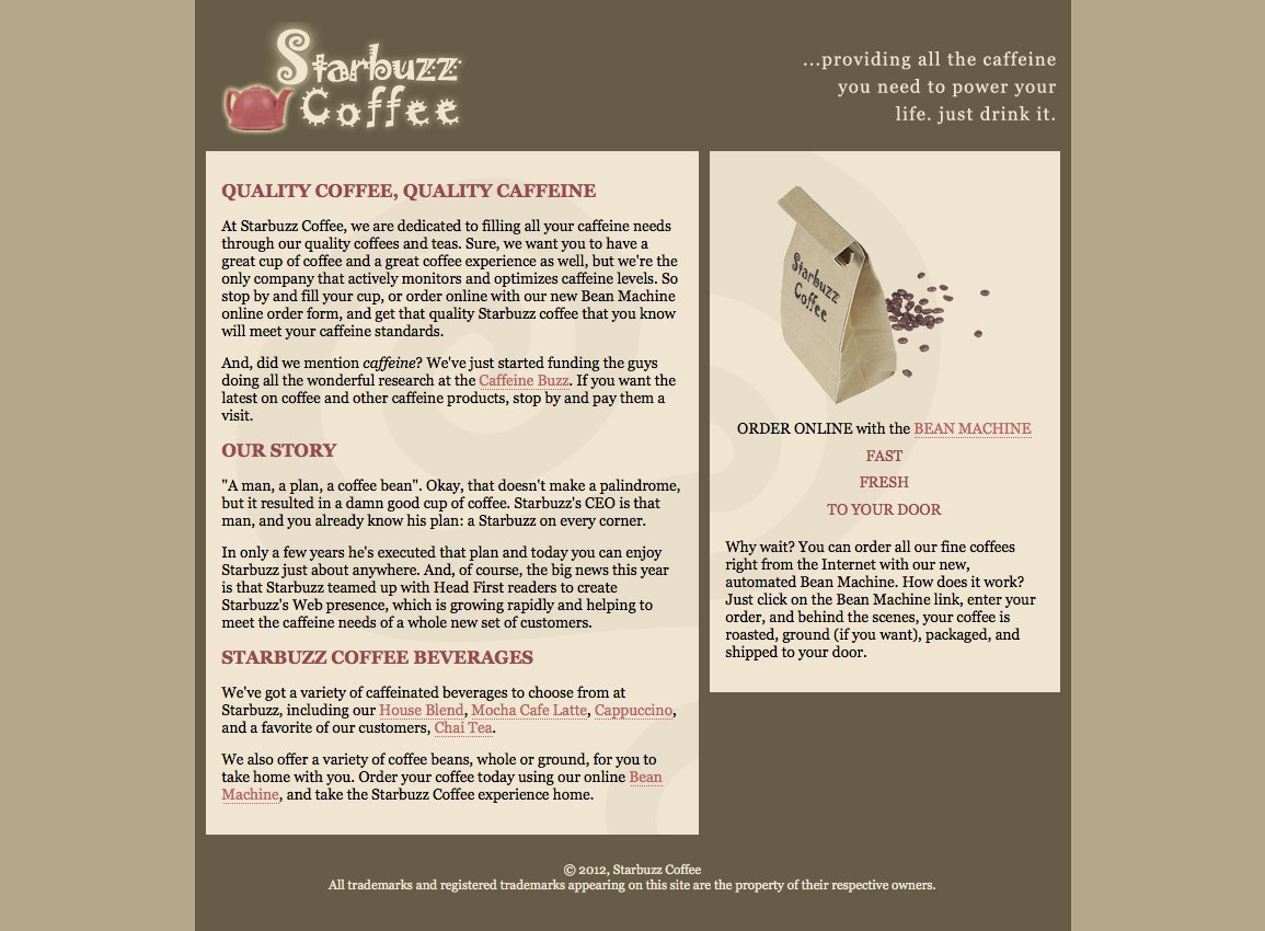
可以看出,已经比以前好多了。但是还是没有解决sidebar和main没对齐的问题。
待续。。。